How to Choose the Right Colour for Your Bespoke Furniture
Choosing the right colour for your bespoke furniture is an important decision. It affects how the room feels and looks. The right shade can make your furniture stand out or blend in, depending on what you want. Colour also influences mood, comfort, and how much you enjoy using the space.
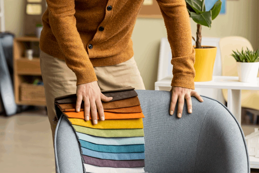
Bespoke furniture is made to order, so it offers a great chance to get exactly what you want. But with so many colours and finishes to pick from, it can be hard to decide. Do you go for something bold or neutral? Should it match the rest of the room or create contrast?
Think about how the room is used. A calm, light colour might suit a bedroom, while a deep, rich shade could look great in a study or lounge. You should also consider how much natural light the room gets, as this can change how a colour appears.
It’s a good idea to look at colour samples in the actual room where the furniture will go. This helps you see how the light affects the colour. Also, try to picture the finished look – how the furniture will work with other pieces, the walls, and the flooring.
With a little planning, you can find the perfect colour that makes your bespoke furniture truly yours.
Choosing Colours That Match Your Interior Style
When picking a colour for bespoke furniture, it helps to match it with your overall interior style. This keeps the space looking balanced and put together. Whether your home is modern, traditional, or a mix of both, the right colour can tie everything together.
Start by looking at the colours already in your space – on the walls, floors, and soft furnishings. Your furniture should fit in with these tones rather than clash. A well-matched colour scheme makes the whole room feel more connected and calming.
Modern and Minimalist Styles
For modern homes, less is often more. Choose clean, simple colours like white, grey, or black. These shades keep the look fresh and uncluttered. Soft pastels also work well if you want something calm and gentle.
Neutral tones help create a sense of space and light, especially in smaller rooms. Add interest with texture or by mixing matte and gloss finishes. Stick to one or two tones for a smooth, unified look.
Classic and Traditional Designs
In traditional spaces, warm and rich colours look best. Deep blues, dark greens, or burgundy add a cosy, timeless feel to the room.
Wood finishes like oak or walnut suit these styles well. They bring natural texture and charm. Pair with cream or soft gold for a layered, elegant feel.
Eclectic or Boho Interiors
If your style is more mixed or bold, you can play with colour. Bright tones like teal, mustard, or coral make a statement and show personality.
Try painted legs with a wood top, or mix patterns with solid tones. Two-tone furniture also works well and adds a fun, relaxed vibe.
Matching your furniture colour to your interior style helps create a space that feels just right. It brings balance and shows off your taste in a simple yet stylish way.
Need assistance finding bespoke furniture near you?
Get a QuotePainted or Natural Wood? Choosing the Right Finish
Another big choice is whether to go for painted furniture or natural wood. Each has its own feel and works best in different types of rooms.
Painted furniture is great if you want a specific colour or a more modern look. It gives you more freedom with style and can brighten up a space. Soft greys, creams, or bold colours like navy can all look fantastic. Painted finishes also help hide marks or uneven surfaces on the wood.
Natural wood, on the other hand, shows off the beauty of the material. Oak, pine, walnut, or ash all have different tones and grains. They can bring warmth and texture into the room. Natural finishes suit traditional or rustic styles but can also work in modern spaces if kept simple.
Think about how much wear the furniture will get. Painted pieces might need touch-ups over time, while natural wood can be easier to keep looking good. The choice depends on the look you want and how you’ll use the piece.
Both options can look amazing, so go with what fits best in your home and with your taste.
Colour Ideas for Every Room in the Home
Each room in your home has its own purpose, and the colour of your bespoke furniture can support that. Here are some ideas to suit different spaces.
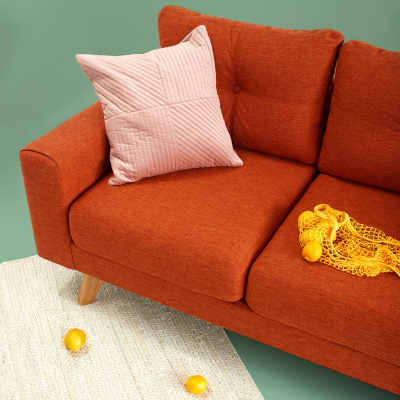
In living rooms, warm tones like soft beige, olive green, or dusky pink create a cosy, welcoming feel. Pale blues or greys offer a lighter, calming mood and suit most styles.
Kitchens and dining areas benefit from light colours. White, light grey or soft green feel fresh and clean. Bolder choices like navy or forest green work well on cabinets or tables.
Bedrooms need soothing tones to promote rest. Pastel blue, soft grey, or warm taupe are ideal. Painted bedside tables or wardrobes in muted shades add gentle charm.
For home offices, deeper tones like charcoal, bottle green, or navy create a focused feel. These suit desks, shelves, or storage units and give a tidy, calm look.
Bathrooms are often smaller, so light colours like white, pale blue, or mint help them feel open. Dark wood can add contrast without making the space feel heavy.
Choosing the right colour for each room helps your furniture fit in and supports the mood of the space.
Expert Colour Tips for Bespoke Furniture Projects
When planning a bespoke furniture piece, using expert colour advice can make a big difference. These tips will help you choose wisely and get a great result that suits your space and personal style.
Think About Lighting
Natural light changes how a colour looks. A shade that seems bright in the showroom might appear dull in your home. Rooms that face north often have cooler light, which can make colours look darker. South-facing rooms usually get warmer light, which can bring out yellow or red tones.
Test colour samples in the actual room and look at them at different times of day. Morning light, afternoon sun, and evening lighting can all show the colour differently. Also, check how the colour looks under artificial light, including ceiling lamps or wall lights, to avoid surprises.
Use a Colour Wheel
A colour wheel helps you choose colours that go well together. Colours opposite each other on the wheel create a strong contrast. These are called complementary colours, like blue and orange or green and red. They stand out and add energy to a space.
Colours next to each other on the wheel, like blue and green or red and orange, are called analogous colours. They create a softer, more relaxed look. The wheel is simple to use and helps you match your furniture with your walls, fabrics, and other items.
Start with Neutrals
If you're unsure where to begin, go for neutral tones like white, grey, or beige. These colours are timeless and blend well with most styles. You can easily update the look later by adding colourful accessories like cushions, rugs, or curtains.
Neutral furniture is also easier to move between rooms if you decide to rearrange or redecorate. It gives you more flexibility and ensures your furniture won’t clash with future changes.
By following these expert tips, you’ll make colour choices that not only look good but also stay practical, stylish, and adaptable over time.
In this article: