The Importance Of Colour
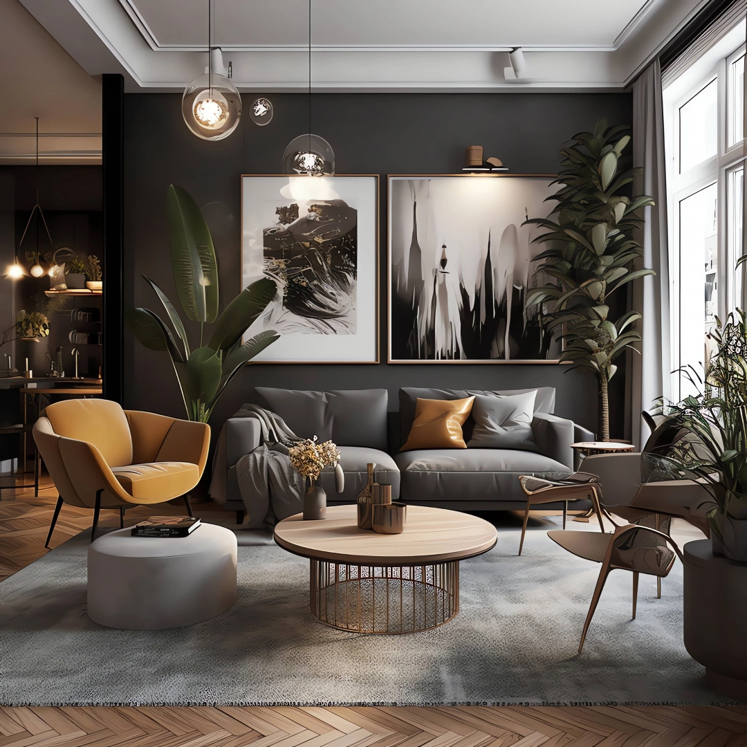
Colour is one of the most fundamental and critical aspects of home design; the selection of hues has a big impact on whether a decorative design is successful or not. Careful use of hue may coordinate furniture and finishes, creating a pleasing and appealing design. Colour has a crucial role in defining the atmosphere of a scheme, thus the designer should let the visual design idea, together with consideration of the geometry and proportions of space, drive and influence the selection of colours.
Colour may also be utilised to alter the perceived size or proportions of a space, giving the impression that a space is larger or smaller depending on its colour. It can visually elevate oppressively low ceilings or reduce ominously high ones. It may make a starkly bright space feel cosier or brighten a dark area. Colour can serve as the decorative scheme's focal point or just as a background. Additionally, certain hues can be used to conjure up specific historical eras.
The Effects Of Colour On Space
Colour choices may change a space's appearance size and form to some extent. The choice of warm or cold hues, or between bright and dark tones, can increase or decrease the appearance of a room's size. Designers may employ the visual impacts of various hues to change how people perceive space by altering how large a space seems to be, how tall a ceiling appears to be, or how wide a hallway appears to be.
Warm colours like reds, oranges, and yellows are known as advancing colours because they look closer to the observer than they actually are; depending on the size of the colour usage area and the intensity of the colour, this can result in two seemingly contradicting visual effects. A tiny, isolated coloured area, such as a piece of furniture upholstered in warm, vivid colours, will appear closer to the spectator and therefore larger than it is. A big, surrounding colour area, such as highly warm-coloured walls, can make a space look smaller than it actually is by making it appear closer. Similar to how neutrals or light tones of the same hue would look farther away, vivid colours and dark tones will appear closer.
Since cool colours have the opposite optical impact, they are often referred to as receding colours. Violets, greens, and blues seem farther away than they really are. In the same way that neutrals and light tones of colour look farther away than intense colours or dark tones of comparable colour, receding colours appear to extend the dimensions of space when employed on wide, surrounding colour regions.
Need assistance finding interior design near you?
Get a QuoteColour Intensity
The phrases "intensity," "saturation," and "chroma" describe how pure, brilliant, or saturated colour is in comparison to how boring, neutral, or grey it is. When the hue is at its average value, a colour is said to be at its highest or strongest intensity. The addition of a colour that is far away from a bright colour can dull or desaturate it, reducing its purity or intensity. More of the dominant hue must be applied in order to really raise a hue's intensity. The object can be lit with strong light of the same hue or placed in contrast with its complementary hue to appear to intensify the colour.
It might be intimidating to see large patches of bright colours. By including grey or the hue that is opposite it on the colour wheel, a colour loses some of its genuine intensity. A hue's perceived intensity can be reduced by lighting it with light that is less brilliant, more diffuse, or of a complementary colour, or by positioning it next to a colour that is either more intense or comparable.
The Dimensions Of Colour
The three components or dimensions of colour - hue, the colour's name; value, the colour's brightness or darkness; and intensity or chroma, the colour's level of strength or purity - must be distinguished to accurately describe colours.
The most noticeable aspect of colour is the hue. The hue of a colour is specified by its name and identified by where it falls on the visible spectrum. Along the visible spectrum, there are countless shades. A hue is an undyed, unadulterated colour. The colour wheel shows hues, and the words "hue" and "colour" are interchangeable.
Value, which is the relative brightness or darkness of a colour, is determined by how much black or white is either present naturally in the pure colour or added to it. The quantity of light that colours reflect determines the value gradations, and values may be modified by adding white or black to make hues reflect more or less light, respectively. Darker values are referred to as shades, whereas lighter values are known as tints. The colour blue can be either bright or dark and have the exact same colour.
Colour Response
Colours and colour temperature affect an interior's ambience and have a psychological impact on observers. The warm side of the colour wheel has hues that look warm, inviting, and invigorating. We may feel energised, excited, or calm by certain colours. A tranquil, soothing impression is produced by colours that are on the cool side of the colour wheel.
Really cold hues may have a depressing psychological effect. Neutral colours are viewed as good and unobtrusive background colours because they have a less strong psychological influence and can express a professional, utilitarian attitude with less emotional depth. They are thought of as being between warm and cold. Extremely neutral colours might come across as lifeless and boring.
Thanks to the yellow in it, green is the warmest of the cool colours. Green is peaceful and pleasant to the eyes since it is often associated with grass and trees. The hue green is seen to be the most natural, having associations with health and happiness. Shades of green denote dignity and firmness; they share these qualities to a lesser extent.
Since they combine the opposing qualities of warmth and coolness, activity and calmness, and may be rather unsettling to certain viewers, violet and purple should be treated with caution. Pale violet cans are associated with femininity and playfulness. Deeper purples may be regal and ethereal.
In this article: