Common Mistakes to Avoid When Ordering Business Signs
Ordering business signs or banners is one of the most visible investments a company can make. A well-crafted sign acts as a silent salesperson, attracting new customers, reinforcing your brand image, and providing vital information at a glance. It can work day and night, all year round, without needing ongoing wages or training. However, the benefits of signage can be seriously reduced if mistakes are made during the design, production, or installation stages.
These mistakes are often simple to avoid but can be costly in both time and money if overlooked. A poorly designed or badly placed sign can confuse your customers or even deter them from visiting your business. Likewise, if the materials used are not suited to the environment, your sign may fade or become damaged far sooner than expected, which could hurt your professional image.
This guide covers the most common errors made when ordering signs and banners, along with practical advice to ensure your investment delivers lasting results. By learning from these common pitfalls, you can make confident choices that help your signage stand out and stay effective for years to come.
Design Mistakes That Reduce a Sign’s Impact
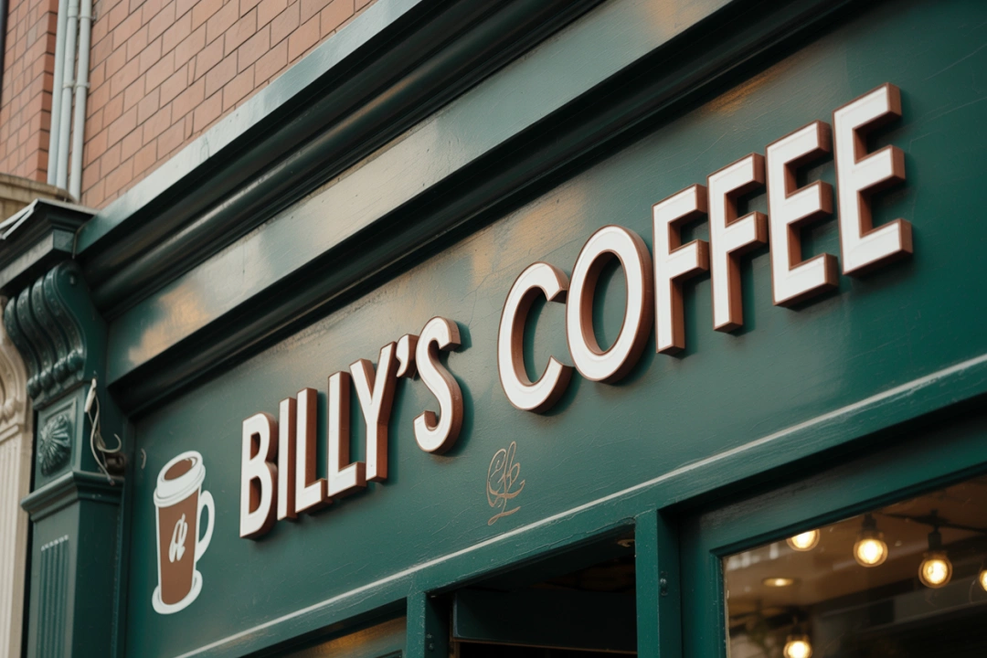
The design of your sign is the first thing that will catch the eye of passers-by. If the design is not appealing, lacks clarity, or is difficult to read, the message will fail to reach its audience effectively. A good sign should not only grab attention but also be easy to understand within seconds. This means careful consideration of layout, font size, colour, and the overall balance of visual elements.
Using Too Much Text
One of the most common mistakes is trying to include too much information. Signs are not brochures, and customers rarely have time to read every detail as they pass by. Focus on the essentials such as your business name, a brief description of your service, and perhaps a single strong call to action. Cluttered text will cause viewers to lose interest before they have absorbed the message.
Consider how your sign will be viewed. If it is near a busy road, drivers will only have a few seconds to see and understand it. Short, bold messages work best in these situations. If your sign is placed in a location where people will be standing still, such as inside a shop, you have more freedom to add details, but you should still aim for clarity.
Poor Colour Choices
Colour plays a huge role in making your sign stand out and be readable. Poor colour combinations can make text hard to read or cause the overall design to blend into its surroundings. High contrast between text and background is key for readability. For example, black text on a white background is easy to read, as is white text on a dark blue background. Avoid pairing colours of similar brightness or shades that clash harshly.
Your choice of colours should also reflect your brand identity. Using colours that are consistent with your logo and other marketing materials creates a more professional and recognisable image. At the same time, ensure that your design still maintains high visibility in its actual location.
Small or Hard-to-Read Fonts
Even the most creative design will fail if the text is too small to read. Choose font sizes that suit the distance from which the sign will be viewed. Outdoor signs often need larger text than indoor ones, and drivers need bigger lettering than pedestrians do. Fancy or decorative fonts may look stylish up close, but they often reduce legibility from a distance. Bold, simple typefaces are usually the most effective for signage.
It is also important to leave enough space around the text. Crowded lettering makes reading harder and can make the whole sign appear messy. Giving your text room to breathe helps improve both readability and the visual appeal of the design.
Need assistance finding signs and banners near you?
Get a QuoteOrdering Without Checking Local Rules
Another frequent error is failing to check local rules and regulations before placing an order. Councils and planning authorities often have strict guidelines on the size, style, lighting, and placement of business signs. Ignoring these rules can result in fines, orders to remove the sign, or expensive alterations to make it compliant.
Some areas require businesses to obtain planning permission before installing certain types of signs. There may be restrictions on illuminated signage, limits on the use of banners, or specific requirements for heritage or conservation areas. These rules are designed to maintain a consistent look in the local environment and to ensure safety.
Checking the regulations before you commit to a design will save time and money in the long run. Contact your local council or planning office to confirm what is allowed in your area. It is also worth asking your sign supplier if they are familiar with local rules, as experienced providers often know the common requirements for different locations.
Failure to comply not only risks legal consequences but can also harm your reputation. Customers may see non-compliant signage as unprofessional or careless. Following the rules shows that your business is responsible and committed to working within the community’s standards.
Choosing the Wrong Materials or Finishes
The materials and finishes used for your sign have a huge impact on how it looks and how long it lasts. Selecting the wrong ones can lead to fading, warping, peeling, or other forms of damage. This can shorten the lifespan of your sign and give customers the impression that your business does not care about quality.
Outdoor signs must be designed to withstand rain, wind, sunlight, and temperature changes. Cheap materials may look fine when new but quickly degrade when exposed to the elements. Banners, for example, should be made from strong, weather-resistant fabric with reinforced edges to prevent tearing. Similarly, permanent outdoor signs should be made from durable materials such as aluminium or treated wood, with protective coatings to prevent damage.
Indoor signs can be made from lighter or less weather-resistant materials, but they still need to be durable enough to handle everyday wear and tear. The choice of finish also matters. A gloss finish can make colours look vibrant but may cause glare under certain lighting. A matte finish reduces reflections but may slightly dull the colours. Choosing the right combination depends on the sign’s location and purpose.
Discuss your needs with your sign supplier before making a decision. They can recommend materials and finishes that balance cost, appearance, and durability for your specific situation. Spending a little more upfront for quality materials often saves money over time, as the sign will last longer without needing replacement.
How to Avoid These Mistakes from the Start
Many of the mistakes discussed here can be avoided with proper planning and by working with skilled professionals. By taking the time to research, seek advice, and check details before placing your order, you can ensure your sign works effectively from day one.
Work with a Professional Designer
A professional designer can take your ideas and turn them into a polished, effective sign. They will consider factors such as colour contrast, font size, layout, and the overall balance of the design. They can also help ensure your branding is consistent with other marketing materials, making your business more recognisable and memorable.
Professional designers often have experience working with sign manufacturers, which means they can create designs that work well with the chosen materials and production methods. This can help avoid problems where a design looks good on a screen but does not translate well to a physical sign.
Check All Requirements Before Ordering
Before you confirm your order, make sure you have checked every local requirement that applies to your sign. This includes confirming the maximum allowed size, permitted locations, lighting restrictions, and any rules for temporary banners. Getting approval in writing from your local authority can provide peace of mind and prevent disputes later.
Even if you have ordered signs before, rules can change over time. Always double-check before proceeding, especially if your new sign is larger or different in style from your existing one.
Choose Quality Materials for the Job
Investing in high-quality materials will help your sign remain attractive and functional for longer. Consider how the sign will be used and where it will be placed. For outdoor signs in sunny areas, UV-resistant coatings can prevent fading. For high-wind locations, reinforced mounting systems can keep the sign secure. Indoors, lighter materials may be fine, but choose finishes that will keep the sign looking clean and professional.
Ask your supplier for samples or examples of similar signs they have made. Seeing the materials in person can help you make an informed choice. The right materials may cost more upfront, but will save you from having to replace the sign sooner than expected.
In this article: