
How to Make Your Business Signs Stand Out
Signs and banners do more than carry a name. They tell people who you are, what you offer and why they should care. A strong sign gives a clear first impression and helps your business feel open and ready for customers. It works for you every day, guiding people to your door and reminding them of your brand.
To stand out, your signage needs a simple plan. Begin with a message that is easy to read at a glance. Add colours that fit your brand and keep contrast high so the text stays sharp. Choose materials that suit the weather and the location. When the basics are right, your signs will look good and last longer.
Good design is not only about style. It is also about what your audience needs. A sign on a busy road must be clear from far away. A banner in a shop window can hold a little more detail because people stand closer. By matching the sign to the space, you avoid clutter and make the message easier to take in.
Small choices make a big difference. The font style and spacing affect how quickly a person can read your words. Borders and icons can guide the eye. Lighting can lift a design at night or on cloudy days. These details help your signs and banners do their job without getting in the way.
This article explains the key elements that help a sign stand out, why standing out matters, common mistakes to avoid and how different businesses think about signage. Use it as a checklist when you plan your next sign or banner. With a clear approach, you can create signage that attracts attention, builds trust and supports sales.
Key Elements That Make a Sign Stand Out
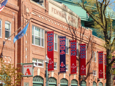
Great signs mix clear words with strong visuals. They use a layout that draws the eye and a message that can be understood in seconds. The best banners follow the same rules. Keep it simple, make it bold and place it where people will see it when they need it.
Clear and Readable Text
Readable text is the heart of any sign. Use a plain font, set the letter size for the viewing distance and leave enough space between lines. Limit yourself to one or two font styles so the message feels tidy. If a driver has only a moment to look, they should still grasp the main point. Short words and simple phrases help people understand fast.
Strong Colour and Contrast
Colour sets the mood and helps the text stand out. Pick a palette that matches your brand and keeps contrast high between the background and letters. Dark text on a light field or light text on a dark field is easy to read. Avoid putting similar shades together because they blend and reduce clarity. Test your colours in daylight and at night so your signs and banners work in all conditions.
Simple Layout with a Focal Point
A clean layout guides the eye from headline to detail. Place one strong focal point such as a logo, product image or short call to action. Use space to separate parts of the message so nothing competes. If you include contact details, keep them short. A web address is often enough. Too much information can distract from the core idea and lower the impact.
Placement, Materials and Lighting
Even the best design fails if people cannot see it. Choose a position that lines up with natural sight lines, like doorways, road bends or the path to a till. Match the material to the weather. Vinyl banners suit outdoor events and mesh banners cope with wind. Rigid panels or aluminium signs last longer on a shopfront. Add lighting where footfall continues after dark so your message stays visible and your brand feels active.
Need assistance finding signs and banners near you?
Get a QuoteWhy Standing Out Matters for Your Business
People see many messages each day, so your sign must earn attention. When your sign is clear and bold, it helps strangers feel confident enough to step inside. A strong exterior sign also acts like a landmark. Locals use it to give directions and visitors use it to find you without stress. This reduces missed visits and increases the number of people who come through the door.
Standing out also supports memory. When someone notices a neat banner or a smart shopfront, they store that image. Later, when they need your product, the memory returns and they are more likely to choose you. In this way, effective signage works like silent advertising that runs twenty four seven without extra fees. Once fitted, it keeps doing its job with small costs for cleaning or maintenance.
There is a link between good signs and trust. Fresh colours and tidy edges suggest care and pride. Clear words suggest honesty. When a customer feels that a business pays attention to its signs and banners, they expect the same care in the service. This feeling can lift reviews, increase referrals and support long term growth.
Common Mistakes That Make Signs Less Effective
Too much content is the mistake most people make. Cramming a sign with every service, price and contact detail leaves the viewer with no clear idea. It is better to state one main message and invite people to learn more inside or online. Keep the hierarchy simple. Headline first, key benefit second, call to action last.
Poor contrast is another common issue. Light grey text on a pale background looks smart on a screen but fades in sunlight. Thin fonts and tight spacing also hurt legibility, particularly at a distance. Always print a small proof and step back to see how it reads. If your eyes struggle, the design needs more weight and more space.
Finally, many businesses forget about placement and upkeep. A banner that hangs behind a tree or sits too high on a wall will never be seen. A shopfront sign that peels at the corners or flickers at night sends the wrong signal. Plan for regular checks and quick repairs so your signs always look fresh. This protects your brand and your investment.
How Different Types of Businesses Approach Their Signage
Different sectors use signs for different goals. Some need to draw in passing trade. Others need to direct people once they arrive. By matching the style and the message to your audience, you can make sure your signs and banners do the job you need them to do.
Retail and High Street
Retailers rely on visibility and pace. A bright fascia sign helps shoppers spot the store from a distance. Window graphics and hanging banners support seasonal offers and guide people to new ranges. Simple messages like new in or up to half price are easy to read from the pavement. Inside the shop, small signs point to sizes, fitting rooms and tills. The aim is to reduce friction so people can browse, choose and pay without delay.
Hospitality and Leisure
Restaurants, cafés and gyms use signage to set a mood as well as to inform. A warm exterior sign and a clear menu board invite people to stop and look. Removable banners are useful for special events, weekend menus and membership drives. Chalkboards work well where the offer changes each day, but the main sign should stay steady so regulars can find the place at a glance. Wayfinding signs help guests move from entrance to table or from reception to lockers without confusion.
Professional and Service-Based
Firms such as clinics, salons and repair shops often prefer a calm, tidy look. They use clean fonts, careful spacing and a modest colour palette to signal trust. Exterior signs focus on the name, the service and the opening hours. A simple banner may promote a free check or a new treatment for a limited time. Inside, door plaques and reception signs help visitors feel sure they are in the right place. The tone is helpful, not loud, which suits the expectations of these clients.
In this article: