
How to Choose the Right Signage for Your Business in the UK
Choosing the right signage for your business in the UK is a direct way to raise awareness and guide customers to act. Well planned signs and banners greet people in all weather and at every hour, turning a quick glance into a visit or a sale.
Strong signage explains who you are, shows what you offer, and builds trust. Clear words, tidy layouts, and thoughtful placement help your brand stand out on a crowded high street or in a busy retail park. Careful choices on materials and lighting ensure your investment lasts.
This guide offers plain advice to help you pick signs or banners that fit your goals and budget. You will learn which factors matter most, how different sign types work, and what pitfalls to avoid. Simple tips at the end will help you get more value from every pound you spend.
While every site is unique, the same core principles apply in most cases. Keep the message clear, make visibility a priority, and choose build quality that suits your climate and footfall. With those basics in place, your signage can do quiet, steady work that lifts brand recall and improves sales.
Key Factors to Consider When Selecting Business Signage
Before you lock in colours or finishes, think about who needs to see your sign and from where. A short review of the basics will save time later and help your signs and banners do the job you want.
Location and Visibility
Start with the view from the street. If most passers-by are in cars, choose large, high contrast lettering that can be read in a second. If your audience is on foot, you can include a little more detail, but the main message must still be clear from a few metres away.
Visit the site at different times of day to check glare, shadows, and traffic patterns. What works at noon may be hard to read at dusk or on a rainy afternoon.
Design and Branding
Good design is simple. Choose one focal point, usually your name and logo, and make everything else support it. Use clean, legible fonts and set generous spacing. Keep to two or three colours, and add a short call to action if space allows.
Materials and Durability
Think about rain, frost, and sun. For shopfronts, aluminium trays, acrylic letters, and toughened panels offer long life. For banners, pick reinforced PVC or mesh for windy sites, and choose good fixings that suit brick, glass, or cladding.
Budget and Maintenance
Set a budget that covers design, manufacture, installation, and any permissions. A robust system often costs less over time than a bargain option that fades or tears. Plan simple cleaning and keep paint and vinyl codes on file for future matches.
Need assistance finding signs and banners near you?
Get a QuoteUnderstanding the Different Types of Business Signage
No single sign suits every site. The most effective programmes combine several pieces that work together, each with a clear role. Here are common options and where they fit best. Shopfront fascia signs sit above the entrance and carry your name. They anchor your identity and must be readable from across the street. Flat panels are cost effective, while built-up letters add depth. Projecting signs sit at right angles to the wall and help people spot you along the pavement.
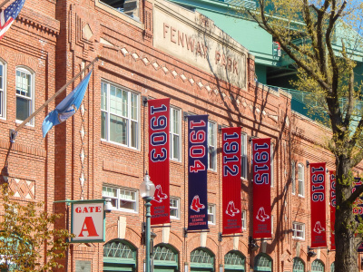
Window graphics turn glass into messaging space. Opaque vinyl offers privacy, while see-through film keeps interiors bright. Use windows for short offers or seasonal themes so you can refresh without changing the main fascia. A neat set of opening hours by the door saves visitors from guessing. Banners are light, flexible, and ideal for short campaigns. A clear banner across scaffolding or railings reaches many eyes at low cost. Choose mesh for exposed sites to let wind pass through and add reinforced hems with eyelets or a pole pocket for tidy fixing.
Pavement signs sit close to foot traffic and draw attention to daily deals. Keep messages short so people can read them as they walk. Place them where they will not block prams or wheelchairs and bring them in at night to prevent wear. Illuminated signs extend visibility into the evening and on grey days. Options include halo lit letters, face lit letters, and lightboxes. LEDs are efficient and can be dimmed to suit the street. If you trade late, lighting may be the best upgrade you can make.
Directional and safety signs help visitors find entrances, parking, and delivery bays. Clear arrows and consistent symbols prevent confusion and reduce calls for directions. In workplaces and schools, compliant safety markings are required, so check current guidance before ordering. Portable displays work for events and pop-ups. Roll-up banners pack into a carry case. Pop-up walls create a simple backdrop for photos and talks. Feather flags add height outdoors where other signs sit low. Each tool is easy to transport and store.
Common Mistakes to Avoid When Choosing Signage
Many problems start with good intent but poor execution. Learning from common errors will save time and protect your brand from sending mixed signals. Clutter is the most frequent issue. A sign that tries to say everything ends up saying nothing. Avoid long lists, tiny icons, or busy backgrounds. Leave space around your main message and keep supporting details small. When in doubt, remove an extra line and make the key words larger.
Low contrast reduces impact. Pale letters on a light background or dark text on a shadowy surface make your sign fade into the scenery. Test your design in black and white to check contrast. If the shapes are easy to read without colour, they will be even stronger once colour returns. Overlooking local rules can lead to delays or fines. In conservation areas and listed buildings, there are limits on size, lighting, and mounting. Speak to your council or a local planner before you start. If permission is required, factor the timeline into your launch plan.
Cheap fixings cause early failure. Flimsy clips, narrow cable ties, or weak adhesives cannot stand up to wind and rain. Ask for stainless steel fixings for outdoor use and make sure banners are tensioned properly. A solid install keeps the sign straight and safe. Neglect is another culprit. A cracked panel, flickering light, or torn banner tells people that care is missing. Inspect your signage each month. Replace faulty parts, tighten loose screws, and clean surfaces so your brand always looks ready to serve.
Tips for Maximising the Impact of Your Business Signage
Once your signs are in place, small steps can lift performance day after day. The aim is to help more people notice, understand, and act. These practical ideas are easy to apply across retail, hospitality, services, and community groups.
Keep Messages Short and Actionable
Decide the one action you want from a passerby and write toward it. Use verbs that prompt movement, such as Visit, Book, or Try. If you promote a discount, state the number plainly and avoid vague terms. A banner that reads Half price lunch until 3pm is stronger than one that says Great value food today.
Place the call to action where the eye lands first, which is often near the centre or the top third. Avoid burying it at the end of a dense block. If you include a URL, keep it short and memorable, and test that it loads quickly on mobile data.
Use Lighting and Contrast Wisely
Light draws the eye. Add gentle illumination to bring letters forward from the background and to make colours pop on dull days. Check that brightness suits the street at night. Pair light letters with dark fields or the reverse and avoid patterned backgrounds behind the main text.
For banners, pick solid fields with bold type rather than busy photos. If you must use an image, place text in a clean block with ample padding. Test print a small sample before you commit to the full run so you can check legibility at a glance.
Refresh Content and Track Results
Plan a simple cycle for updates so your signs and banners never feel stale. Rotate a pavement sign headline each week and replace outdoor banners before they fade. Track results with small tests, such as counting scans of a QR code or asking new customers what brought them in. Over time, these signals will show which designs deliver the strongest response.
In this article: